

Challenge
I work for one of the largest Canadian news media organizations. For many of our readers, National Post is part of their daily lives to inform them of current events.
A big problem is that despite the majority of our readers access our site on their mobile devices, our mobile responsive site is extremely frictional. Problems include slow loading time and too many pop up ads throughout an article. These pain points made it hard for our readers to stay engaged and justify their subscriptions.
Constraints
Aside from a massive stakeholder map (engineers, QA, Ad Ops, CMS, and Editors), our biggest internal constraint is to meet all different departments’ expectations in order to align their definition and goal for growth.
My Role
I developed research plans and facilitated workshops. As a research team of one, I collaborated mostly with the senior UX designer, Julie. I conducted interviews while Julie and I synthesized research and presented the insights to stakeholders.
Outcome
This project is currently on-going. Through my research and co-creation workshops, we learnt what matters the most is to put the right content at the right time to our readers. Not only did I identify actionable opportunities for the organization, but also made recommendations that drove up reader engagement. As we continued to explore new ways to enhance our readers' mobile experiences, we are also making an effort to reduce revenue-driven-neglecting-UX features.
Process
Part 1: Stakeholder interviews
Part 2: User Interviews
Part 3: Co-creation
Part 4: Usability Testing

← from the alignment activity I ran with stakeholders
- Me: “How can you improve communication between teams?”
- Unidentifiable stakeholder: “Safe words when we know it’s bad.”
- Me: 😂
Part 1: Stakeholder interviews
Working with cross-functional teams helps us be resourceful, but we also face “broken-telephone” problem. I needed to align stakeholders’ priorities and resources before I talk to our readers.
Goals
Align priorities, end goals, and expectations
Describe stakeholders’ motivations, objectives, and metrics of success (KPIs)
Gain a better understanding of “How you do what you do?”
Insight 1: Mobile is treated as an afterthought
Our stakeholders agreed that we work in a desktop-heavy work environment. If we change the mindset of putting mobile first, we will need more awareness and cultural change within the organization. A common ask is we need more mobile devices for building, testing, and QA among editors and product teams.
Insight 2: Fixing the speed and technical performance of mobile is critical
Our systems were originally developed by separate teams to meet different needs of advertisers, editors, and readers. So each had its own implementation and user experience. Though it may not have been obvious to our readers, we were maintaining a fragmented experience spanning multiple applications. I ran an activity with the stakeholders to prioritize their goals. They agreed on fixing the speed and performance as our top priority.
Impact: Faster loading speed and stakeholder grids
The second insight led the development team explore the Accelerated Mobile Pages (AMP) eco-system. AMP will allow us to dramatically improve our site load times – now sites load in under 3 seconds. As for our UX team, this is our first time learning the resources and values of our stakeholders. After each interviews I recorded all the findings in a stakeholder grid - a living document that helps my team to align the languages the other stakeholders use.
Methods
45 mins - 1 hr in-person and remote interview. We provided transcripts for stakeholders to review after each interview.
Alignment activity
Participants
In total I interviewed 15 stakeholders from the front-end, back-end, Ad Ops, CMS, and editors teams. The same group of people participated the alignment activity.
Synthesis
Affinity diagram mapping on Mural Board
Stakeholder grid on Airtable

← With the design aid from my partner Julie, we printed out the paper that’s familiar to our stakeholders. After we presented our insights, we handed out the UX Post as tangible takeaways. This paper became a hit in the company and many stakholders who were not involved in the research were also adopting this process and applied their works.
Part 2: User Interviews
This was the first time we’ve ever conducted user interviews with a focus on mobile.
Goals
We want to learn how mobile users from age 16 - 75 currently consume news and what their experiences are of National Post.
Insights
The overarching theme: National Post mobile readers want their news “up to date” and “straight to the point”. The participants were left with the impression that the homepage doesn’t change much during the day. There is no way for them to tell if the new stories are updated or prioritized.
“I’m looking at this (home page) and it’s not by any stretch of the imagination organized by importance or relevance.”
Through my research, I found that our mobile users tend to check back a couple of times throughout the day. Normally, they read the news first thing in the morning. It’s part of their daily routine to find out what they missed from previous night. They wanted us to curate their experience based on the current event, but not limit it. We need a system that empowers our readers to explore content outside of their interests.
Methods
Semi-structured remote and in-person interviews
Participants
• 15 readers of various demographics
• A mix of subscribers and non-subscribers of National Post
Synthesis
We used inductive coding method. We merged raw notes into categories, then later into themes using Mural Board.
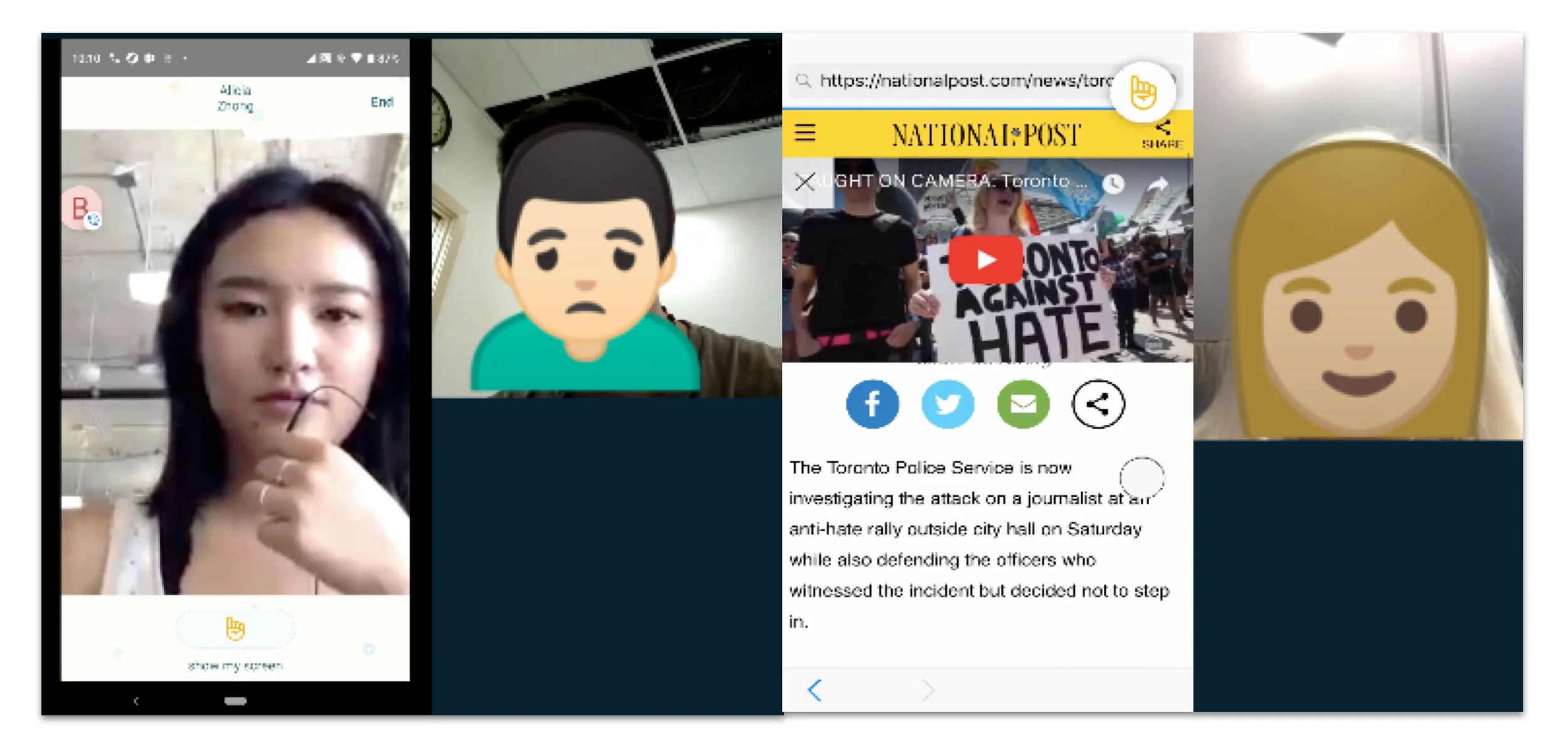
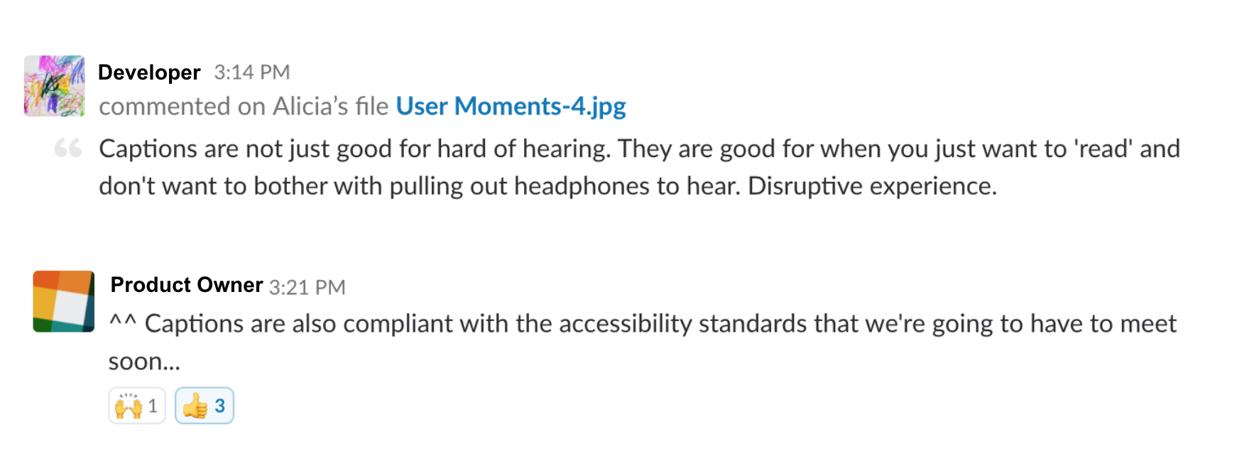
Socializing the insights - User Moments

←The best type of research insights are the ones that can inspire team to take actions. One day I saw the brilliant TTC subway campaign “You Said It” that reinforce a positive behaviour change. Inspired by the campaign, Julie and I created “User Moments” to promote research insights.
Another User Moment example
After we posted distilled User Moments on Slack, it provided ample exposure time for the our scrum team to get the message across. This is our way to communicate research insights in an empathetic format in order to drive more conversation about users.

Part 3: Co-creation
The research insights informed us that our readers are constantly using National Post’s home page as news feeds to check breaking news throughout the day.
Goals
To explore what a customized space within our digital experience could look like, we want to understand our readers’ mental models first.
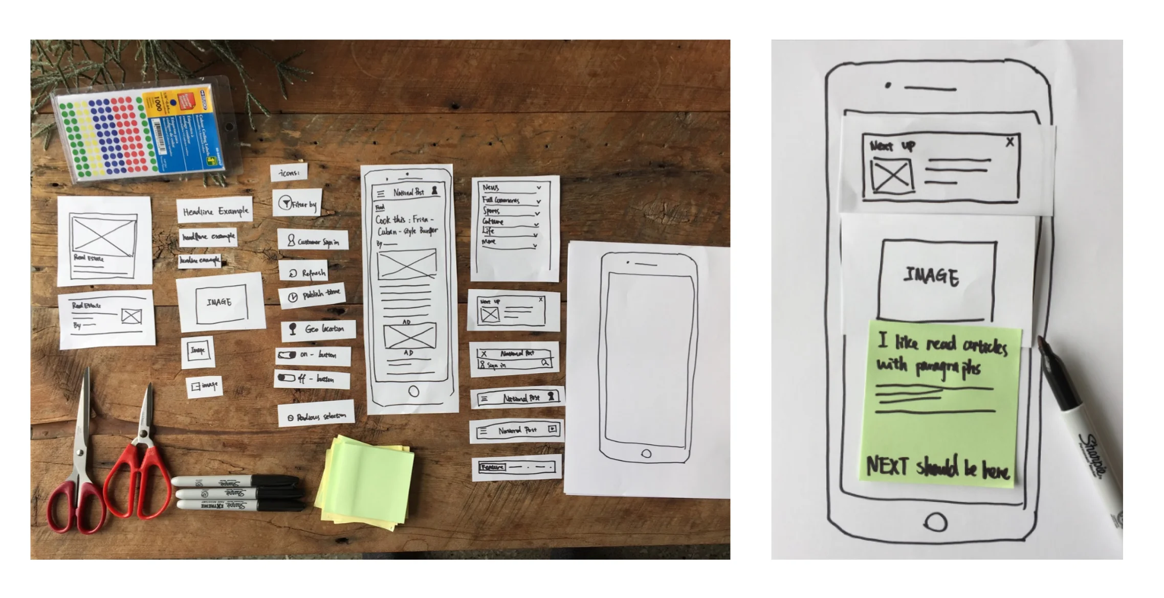
Running the workshop
We invited our frequent readers to come to National Post’s HQ in downtown Toronto. After an engaging ice-breaker activity, I presented an empty mobile “screens” with story cards/ buttons/ widgets/ windows/ tags. I asked the participants to construct their ideal homepage in a concrete way that expresses what matters to them most and justify their decisions.
Methods
Participatory Design
Participants
8 frequent readers who are subscribers, interested in subscribing, and non-subscribers
2 stakeholders as observers and notetakers


*Silvia is a civic lawyer and sports enthusiast who frequents National Post news for job functions. She has very limited time to catch up with the news while having breakfast in the morning.
(*All users’ identifying information has been changed to protect their privacy)
Insights
After talking with our readers about their use cases, it became clear that the ability to customize the categories is a promising opportunity to serve our readers’ need. Our readers showed us the homepage feed is a balance of customized content and prioritization of importance by editors. Through the workshop, we also learned that our readers were interested in having a space to “park” the editorial content, so that later they can come back and check the comments and additional development of the story they are following.
Part 4: Usability Testing
During our sprint cycle, we want to ensure that we are on track with building the features that meets our users’ needs.
Goals
Identify the user’s preferences and verify whether the proposed interface design meets the needs of user
Evaluate the accessibility for a user to accomplish the basic tasks for the first time they use the new website
Reveal the work-arounds that user tried to recover from the errors they make and the rationals behinds it
Insights
This is an on-going project.
Here’s what learned so far: Not only are we able to access the usability of our new design, but we also learned how to maximize recruiting our own panelist. e.g. setting up a successful outreach campaign on MailChimp.
Finding the right audience to conduct these tests is a challenging topic. Design research is a craft. Given the time I will progress and learn more about the practices as well as refine my toolboxes and skills.
Methods
Remote usability testing on lookback.io
Navigation preference tests on UsabilityHub
Participants
Each week during development sprints I interview 5 National posts readers from different demographics
A mix of subscribers and non-subscribers
Synthesis
I divided my findings into 3 tiers:
High-impact problems that are high risk if we don’t fix them soon
Moderate probelms
Low-impact problems that are low risk to not solve them
After each usability testing I recorded all the findings in a repository which is accessible to the team.
Impact
Taken into consideration that our users will increase usage on our new and improved mobile AMP pages, subsequent product and design decisions are made with more confidence.
Personal reflections
Like many other enterprises, we adopted the agile methodology. But, incremental development doesn’t equate to incremental insights. After publishing this study, we received more buy-in for future user research projects that are focused on gathering qualitative data.
The organization is changing one step at the time and my role as a design researcher also includes supporting that bridge that closes the gap between stakeholders and our readers.